When the Vegas Golden Knights hit the ice for the first time in 2017, their jerseys instantly turned heads. The matte steel-gray base, metallic gold accents, and modern helmet crest gave Vegas a look that was sharp, clean, and impossible to miss.
Since then, the franchise has used its uniforms as a way to show off the vibrant city they play in. There have been glittering metallic gold alternates, vivid Reverse Retros, and the throwback-inspired Winter Classic look in 2024, each design a clear nod to Vegas’ mix of flash and tradition.
In less than a decade, the Golden Knights have built one of the NHL’s most distinctive wardrobes. Here’s a look at how their jersey history has evolved.
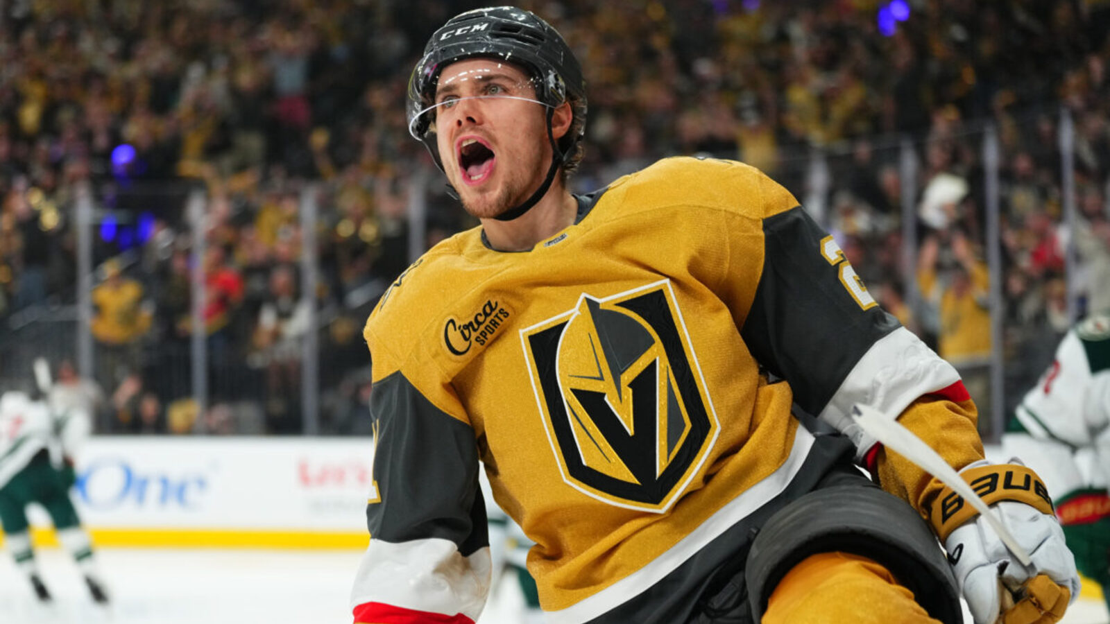
2017-Present Gray Home/Alternate
Entering the NHL, the Golden Knights swiftly caught the eyes of fans when they were on the ice with their gray home jerseys. An iconic look, it gave the team a clean, distinctive appearance in the city where they played.
“Part of (owner Bill Foley’s) mantra is ‘always advance, never retreat,'” said Vegas Senior Vice-President and Chief Marketing Officer Brian Killingsworth. “He always thinks about the next step, the next acquisition, the next goal, the next project.”
The gray, along with the black, metallic gold, and hint of red, capitalizes on the ‘Vegas’ identity, although it’s certainly not the boldest jersey on this list. Now, the gray jersey remains the Golden Knights’ alternate jersey, as the team moved on from it as their main home jersey in 2020.
The Golden Knights wore the jersey five times last season.
2017-Present White Away
Plenty of Golden Knights greats have worn the team’s white away jersey, from original cornerstone Jonathan Marchessault to fan-favorite goaltender Marc-André Fleury. With its clean white base and metallic gold accents, the uniform has become a staple for the franchise. Paired with black pants, it’s a road look that Vegas fans have grown to love.
Like the team’s other primary sweaters, the white jersey has hardly changed since debuting in the inaugural 2017-18 season, a testament to how well the design has held up.
Over the years, the jersey has been part of some of the franchise’s most iconic road moments, from playoff wins in hostile buildings to winning the Clarence S. Campbell Bowl in 2023. And the metallic gold details would ultimately help build anticipation for the Golden Knights’ first alternate sweater.
Nearly a decade later, the white away jersey still feels fresh, a clean look for one of the NHL’s youngest franchises.
2020-Present Metallic Gold Home/Alternate
The metallic gold on the Golden Knights’ first two jerseys would gradually be incorporated into their first alternate jersey, which featured a glittering all-gold design that debuted in 2020. A twist that tied the team’s identity in Vegas.
“It was one of the most complicated initiatives we’ve gone through,” said Dan Near, Global Head of Adidas Hockey and Lacrosse. “Zero compromise on any of the three main ingredients: performance, colour and material which would hit that ‘sparkle aesthetic.’ Getting those three things right was hard, getting only two of the three was unacceptable.”
The jersey originally served as their alternate, but it has since transitioned into their home jersey, a symbolic jersey that the team wore when winning the 2023 Stanley Cup, among many other playoff games.
“We’re the Golden Knights, we have to own the color gold,” Killingsworth said. “So it makes sense for us to come out big and bold. Kudos to them for coming up with a performance material that’s really never before been done — which we’re really happy with.”
2021 Reverse Retro
The Golden Knights’ 2021 Reverse Retro jersey made its most memorable appearance during the NHL Outdoor Games at Lake Tahoe, where Vegas faced off against the Colorado Avalanche. The striking red color is a deliberate nod to the old Las Vegas Thunder of the International Hockey League (IHL), a subtle connection that ties the modern franchise back to the city’s hockey roots.
Unlike the team’s previous three jerseys, this design swapped out the primary Golden Knights logo in favor of their alternate crest, giving the uniform a fresh, bold identity all its own. Vegas truly went all out with this one—so much so that it’s hard to say if it’s a good thing or not that the team wore the jersey just five times during the 2021-22 season.
Regardless, it remains one of the most visually striking looks in the franchise’s history.
2022-23 Reverse Retro
The NHL brought back its Reverse Retro jerseys during the 2022-23 season, following the success of the 2021 edition, and the Golden Knights added yet another jersey to their wardrobe. Again, this jersey nods back to the Las Vegas Thunder, etching their past into their future.
Another aspect that was woven into the jersey was the glow-in-the-dark element. Players’ numbers and the diagonal Vegas crest would glow in the dark when players would skate on for warm-ups. The team would also have on-ice game presentations to show off the full effect.
2024 Winter Classic
The most recent Golden Knights jersey is their 2024 Winter Classic jersey, which they wore against the Seattle Kraken. The team wore a big ‘V’ as the crest rather than one of their previous logos.
The color scheme also changed with the team shifting to a heritage gold and vintage white, rather than the eye-popping metallic gold they usually wear. On the right leg, they also have the words ‘Vegas’ in cursive.
Despite the venue at T-Mobile Park being packed, fans had mixed reviews on the Golden Knights jersey. The team’s Wild West theme may have worked for some, but for others, it wasn’t effective.
Through the Years
In their short history, the Golden Knights have had their fair share of jerseys. With two Reverse Retro and a Winter Classic under their belts, there is no shortage of creative sweaters in Sin City, featuring ones that pay homage to the past while marking their future.

-1753072802-q80.webp "Penguins' Evgeni Malkin Could Hit Incredible Milestone")

